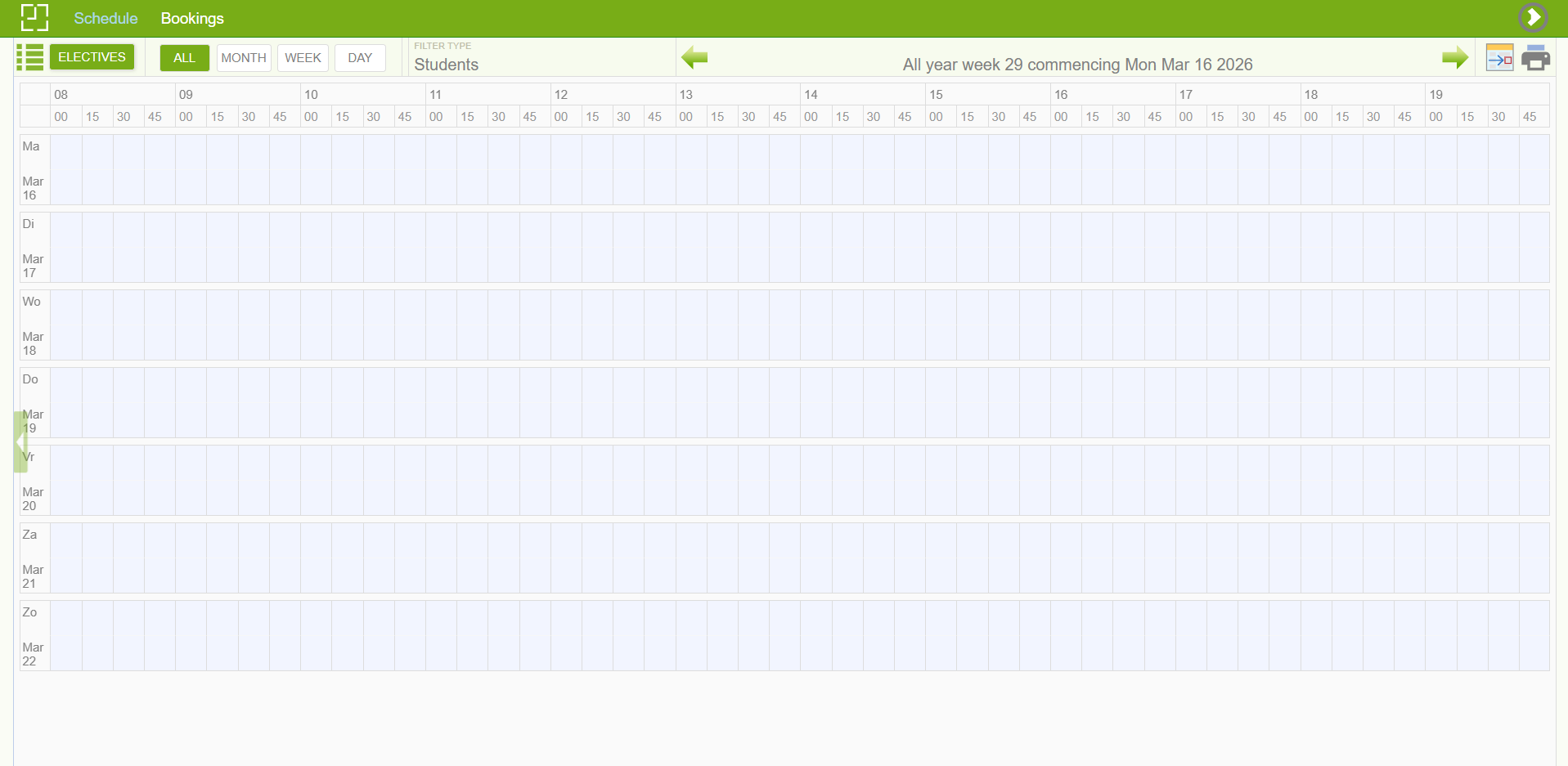
In this project I was tasked to perform my first-time user walkthrough of our university's room booking system, documenting the experience as it unfolded. It was a step by step design critique of the process as it unfolded.
The first thing I noticed was that I had no idea where to begin. The page was dominated by large visual blocks that looked interactive but weren't which immediately set a confusing tone. Nothing on screen clearly said "start here."
Making things worse, an icon in the top-right corner looked like a forward or next button. It was actually a logout. It conflicted with my pre-existing mental model for what a logout button looks like. For a first-time user still finding their footing, accidentally hitting that would mean losing all progress and starting over.
Eventually I found my way to the Bookings section, which opened to a nearly blank white page. The only interactive element was a small search icon placed just below the site logo, with almost no breathing room between them. It’s a violation of the Fitts law: small targets placed near other clickable elements make for uncomfortable interactions and increase the risk of motor slips.
Next up I noticed a problem with responsiveness as clicking the search icon triggered a loading spinner that ran for around 10 seconds. There was no progress bar, just a looping animation that gave no signs of the system working. Ten seconds is long enough for users' attention to wander, and without any reassurance from the interface, it's easy to start doubting whether anything is happening at all.
The next screen asked me to select a "week." however they’re counted according to academical weeks. This is the kind of technical terminology that makes sense to whoever built the system, but means very little to the average student trying to book a room on a Tuesday afternoon. Furthermore, it required me to stop, and leave the page to look up where we were in the academic calendar.
Finally, I managed to find how to submit my booking. It was a small ‘’New’’ button on the bottom right corner of the screen. It was not placed in any place where my attention would be centered, therefore it remained in my peripheral vision. What made it worse was that here were absolutely no visual cues that could signify it being a call to action, nor was the text symbolizing the fact that it's a submission button.
The booking system does many things wrong, the gestalt principles are not followed, the system uses unfamiliar terminology and iconography. Anyone unfamiliar with it will inevitably go through a taxing experience that requires much from their working memory. The problems here are major gaps in the core experience that will possibly cause users to give up. A booking system only works if people can actually use it to book something.