Case Study · Brand & UX Redesign
Improving the User Experience of Help to Solve
Help to Solve is a brand new startup based in Rabat, Morocco, offering technical support services for companies. I was tasked with redesigning their website to make it simpler to use, and to give it an identity worth remembering.
Overview
Two goals: clarity first, then identity
The primary goal was to create a simple, intuitive experience that lets users quickly contact support or book an appointment without any friction nor confusion about what to do next.
The secondary goal was to introduce a distinct brand identity that would help Help to Solve stand out in a competitive, often visually generic market.
Problem
The original site worked against its own users
The original website suffered from a multitude of issues, particularly in the hero section.
-
01
A multitude of calls to action competing for attention within one page.
-
02
A nav bar that made it appear as if each option lived on a separate page, when the site was actually a single scroll.
-
03
Generic design with no distinctive brand identity to anchor it.
-
04
Generic, flat presentation of information that gave the user no reason to keep reading.
Brand Identity
Designing from a blank frame in Figma
I started by manually redesigning the website from a blank Figma frame. The first thing I focused on was a color palette that would make it stand out. Black-and-white backgrounds with rounded blue buttons are the standard for tech companies but I wanted something more original, so I took inspiration from the architecture and landscapes of Morocco instead.
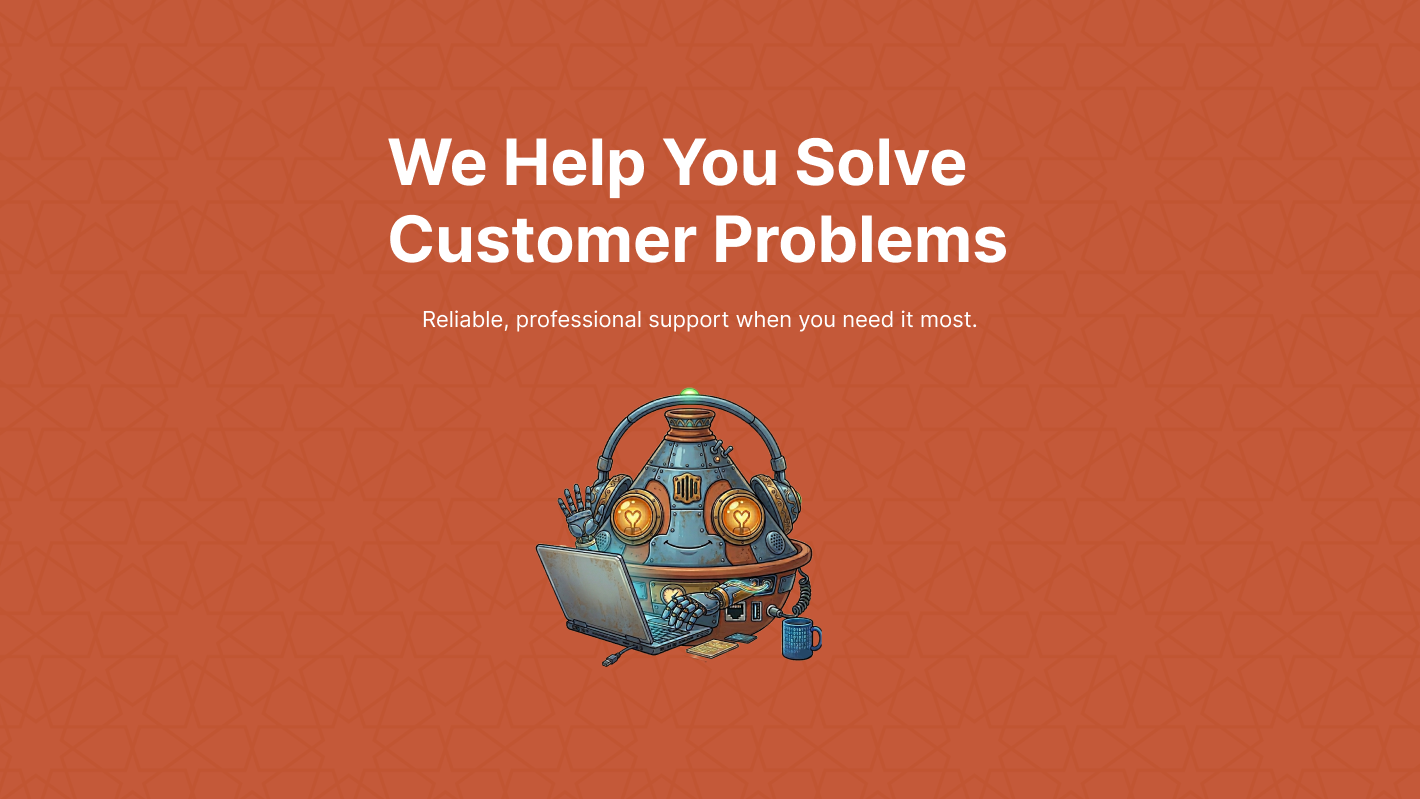
Meet Taji
Next, I gave the website a mascot. "Taji" is a robot designed to look like a tajine, the iconic Moroccan dish — generated with Nano Banana.
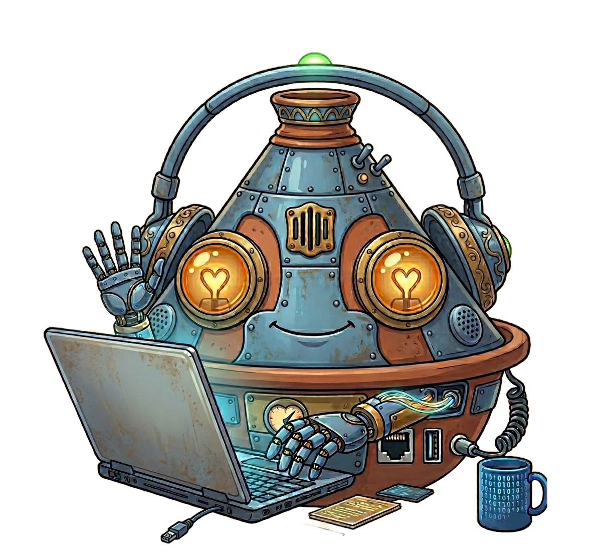
Pairing the palette with Taji ensures the site doesn't feel like another Apple copycat. Whoever visits it will remember it — and will be more likely to come back.
List of Improvements
From four problems to four decisions
Nav bar turned into a wizard that lets the user know exactly where they are on the page.
One clear call to action in the hero section, instead of several competing for attention.
Unorthodox, visually authentic presentation of information rather than generic templated blocks.
An original color palette rooted in the company's own cultural background.
Development
From static Figma frames to a living website
This is where Google AI Studio and Claude came into play. I used these tools to turn my static Figma design into a functioning, animated website that feels smooth to the people using it.
"I want you to code this design of a one page website I made. The website has a nav bar with a background blur. The nav bar serves essentially as a form of wizard, it lets the user see where they are in the process of scrolling through the website and also to quickly get to each section. Each section when the user scrolls appears as a form of parallax, with the next section coming up like a card rather than the standard scroll. The how it works section has the 3 dialogue boxes appear individually as the user scrolls."
Prototype of the finished, animated Help to Solve website.
Reflection
What this project taught me
This project taught me the importance of clarity and prioritization in UX design. Small decisions like turning a confusing nav bar into a wizard, can significantly improve usability and user flow.
I also learned how combining usability with a strong visual identity can elevate a product from functional to memorable. Balancing simplicity with personality is something I would love to keep developing in my future projects.